|
|
|
Biography
 Stickys' Stupiditys' Tagboard
Archives
February 2010 December 2010 January 2011 February 2011 March 2011 April 2011 May 2011 June 2011 Lnks
AuditionSEA
Eddie
jiaqi
Mavis
Shanice
Class blog
|
Friday, February 11, 2011 P A R T TWO In part two we're going to learn:
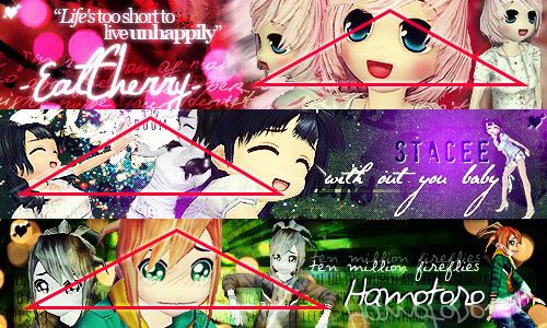
Now, we're going to compose our signature. What does that mean? Basically, just we're going to decide what goes where and how to make it fit together in a way that is appealing to the eye. You have to remember to think about the curves in the signature, since the eye reads from left to right and up to down. Don't stress though, this becomes sort of natural after practice, but for now... I like to choose which screenshots I'm going to use in my signature before I start composing. Make sure that you pick some closeups and some full body/smaller screenshots, or else it gets boring, don't choose JUST CLOSE UPS. It's great to have SOME, but we don't want to constantly look up someone's non-visible nose. Oh, and please try to choose at LEAST two screenshots, sometimes one works (but you have to balance it with other effects) but you'll be safer with 2-3 screenshots. I chose: 1 2 3 The reason that I chose these screenshots is because they fit what I like to use as triangular composition (this is just a word I made up to describe my style of composing signatures xD Don't go around to art teachers saying this) If you don't understand what I mean look at my signatures.  See the common triangular composition? I find that it's appealing to others, and myself  But feel free to try your own ways, as long as you like it, what the hell, just go for it. But feel free to try your own ways, as long as you like it, what the hell, just go for it.On my screen here is how I'm planning to arrange my screenshots. Remember to resize your images before you arrange them because at this highquality/size state, the character's entire face will be the signature...o__o Go to Image > Image size , it should look like this. and play around with it, change the pixels until they fit what you want. Make sure the constrain proportions box is checked so you don't end up with fat/anorexic people when you resize.  I decided to resize image 1 to 450 pixels wide and then photoshop figured out the rest <3 Then take the Move Tool  (first tool on your toolbar) and drag your screenshot to your signature canvas. (first tool on your toolbar) and drag your screenshot to your signature canvas.Because I don't want the big chunky background for when I'm figuring out the composition, I choose the Rectangular Marquee Tool  and make a box around the character. If you still can't find the tool, on your left, in the tool bar, the second box, right click on it and you should be able to select it. and make a box around the character. If you still can't find the tool, on your left, in the tool bar, the second box, right click on it and you should be able to select it.Now make a selection around what you want to keep (don't worry, were not focusing on actually cutting out the image right now, that comes in the next part, we're just trying to get rid of some of the background so we can compose our signature better) Then go to Select > Inverse, it should now select everything else but your box. Go to the layer with your screenshot and just press delete on your keyboard, it should now delete some of the background.  Do this to your other image. Resize, drag onto your canvas, and play around with it until you get a composition you like. This is what mine looks like. Feel free to change your layer style to hard light, or depending on the background, whatever layer style that will allow you to sort of see where you've placed your people. Don't worry about ugliness right now, we're going to learn to cut out the people in the next part of the tutorial. Also, notice the movement and triangle in my signature so far. (The pink line)  Next part, we'll learn to cut out the character from her background, cause we really don't want club bana in our sigs. o3o This is the end of Part Two. ♥ Labels: Signature Guide |